Web Message
Web Message is a customizable popup message with an image and buttons delivered to targeted group of users at a desirable timing. All you need to do is to create and publish a message from the dashboard. Message will be delivered without making any modification to any of the source code or releasing a new version of the website, which allows marketers to run effective marketing campaigns to improve conversions without having developer’s help.

You can deliver effective marketing messages by customizing the settings as follows:
Image
One to four buttons with embedded URL to open a web page from the browser, or a deeplink that routes to any app.
Schedule
The target of users
Display timing of In-App Message
For example:
Deliver a coupon code to users who put items in the cart but didn’t finalize the purchase
Display an appropriate navigation to users who just registered within several days ago to increase their conversion.
You can choose to display the same message only once or multiple times to each user. The number of the message being displayed to each user can be configured from the delivery settings. Please note that web messages will be recorded as read when it gets visually shown on the screen and the measurement results will be reflected accordingly.
Create Web Message
Here we will create an in-app message from the dashboard.
Go to MARKETING > MESSAGING and click CREATE NEW > Web Message

Warning
viewport settings of the website source code, the message template will not be displayed accordingly.viewport , or change the web message settings via the custom message. For all inquiries,Choose Message Template
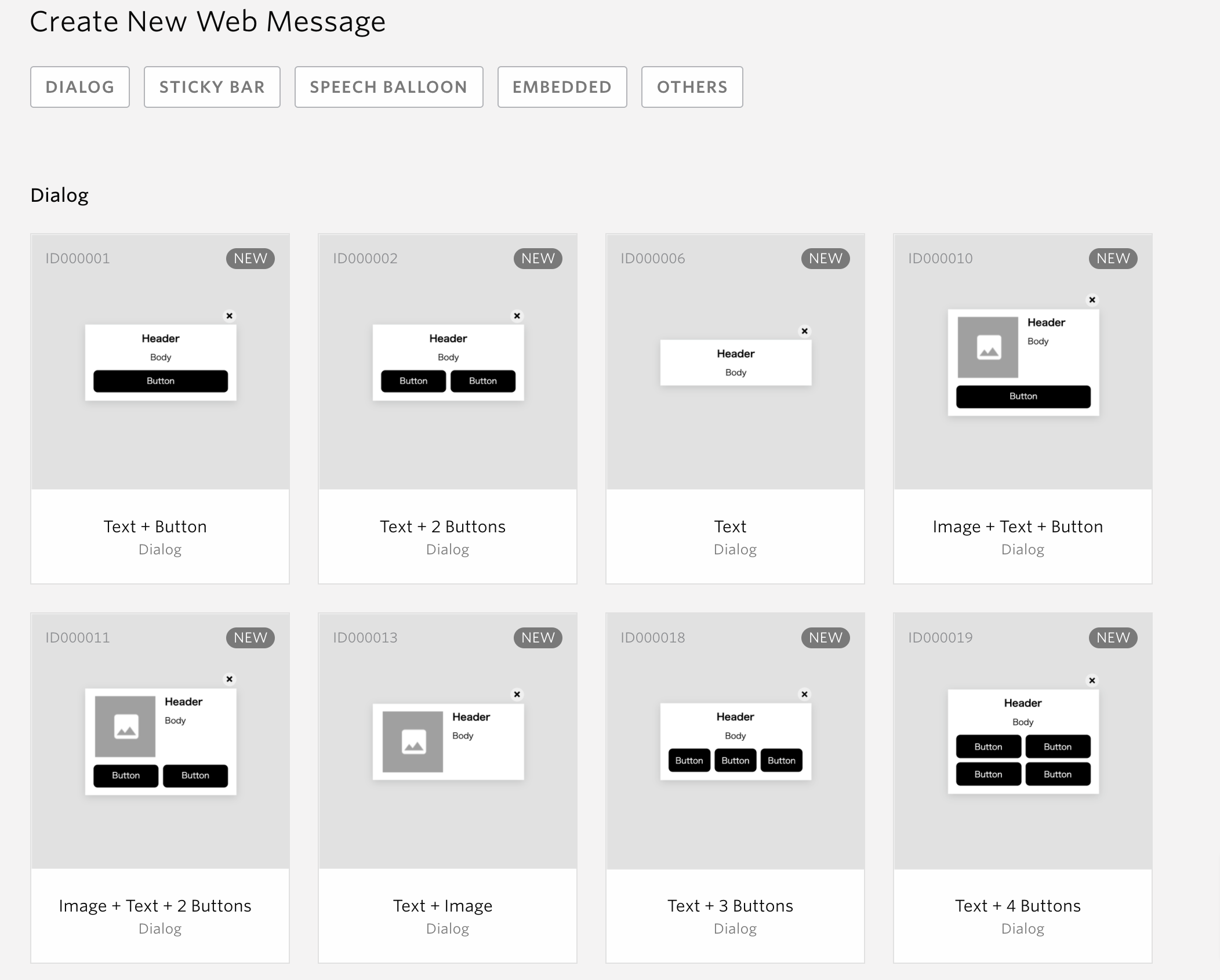
Select the message template from Dialog, Sticky bar or Speech Balloon , Embedded , Others . Templates vary depending on its content. Click the template image and you will be navigated to the message form.
Text: Message will contain header and body
Image: An image can be attached to the message.
Button: Message can have one or two buttons. Clicks to each button can be tracked as a custom event.
Campaign settings
Set a new campaign name and conversion goal to track the results of the messages.

Campaign Name
Set the name for the new campaign. This name can be seen from the list of messages.
Set the Conversion Event
Up to 2 unique events can be set as campaign goals. The total number of users that triggered each event within 24 hours of displaying a web message will be calculated respectively. See Campaign Measurement for more details. See Newsfeed.
Select whether to use the campaign as a newsfeed
You can select whether to use the campaign as a newsfeed using the checkbox in the image above.
The Newsfeed is a history of campaigns which each user has ever received. Using those histories, for instance, you can show the contents of push notifications which you have sent to users so far in your app’s notification screen.
In order to use newsfeed, you can use NewsFeed API to get it. Please refer to Development Guide for more details.
If you are using the Native SDK in addition to the Web SDK, you can also use Native SDK to obtain the data. In this case, you will need to implement it in your app. Please see Development Guide for details
Warning
When using In-app Messages and Web Messages as NewsFeeds, please note that the intended behavior may not occur in use cases such as those described below.
Create a campaign,which has a purchase event as trigger, and Use it as NewsFeeds.
NewsFeeds are created independently of campaigns, so even if a campaign is not displayed, it will still be available as a NewsFeed.
Display timing of Web Message
The display timing of messages can be controlled by the message’s trigger. You can choose the timing based on your use case.
Show message immediately after delivery trigger occurs
This item will be selected as the default setting item. The message will be displayed when the trigger conditions set in the Trigger fired.
Note
For more information on setting up message’s triggers, please click here .
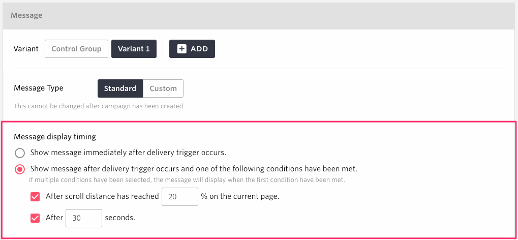
Show message after delivery trigger occurs and one of the following conditions have been met
Warning
This feature requires Custom JavaScript to be enabled. Please refer to Custom JavaScript for more information about enabling custom JavaScript.
After scroll distance has reached % on the current page
The message will be displayed when the page is further scrolled up to the specified rate after the trigger conditions set in the Trigger fired.
After seconds
The message will be displayed after the specified number of seconds have elapsed after the occurrence of the distribution trigger set in the distribution trigger.
Note
The scroll rate can be specified from 1% to 100%.
The number of seconds can be specified from 1 second to 18000 seconds (3 Hours).
If set at the same time After scroll distance has reached % on the current page and After seconds, then the message will be displayed when the first condition have been met.
Reflecting the Pattern Settings in the Control Group
If use Show message after delivery trigger occurs and one of the following conditions have been met, please review the following notes for more accurate measurement of effectiveness.
Warning
If the control group allocation is 1% or more and the message type of pattern1 is Standard , the scroll rate and elapsed time set in pattern1 is automatically reflected in the control group.
If the control group allocation is 1% or more and the message type of pattern1 is Custom, the control group is automatically updated with JavaScript code that includes the scroll rate and elapsed time at the time of the change from Standard to Custom. However, subsequent changes to Custom messages will not be reflected automatically, so please edit the JavaScript in the control group as needed.
If the control group allocation is 1% or more and the message type of pattern1 is Custom, we recommend setting up a JavaScript similar to pattern1 for the control group in order to make the conditions and criteria for comparing it with the control group consistent.
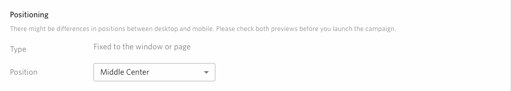
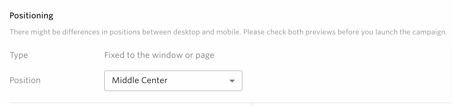
Display Position
Set the display position of the Web message. There are three display types: Fixed on a window or page, Fixed by specifying an element, and Embedded depending on the selected template.
Fixed to the window or page
Pop up content on windows and pages.
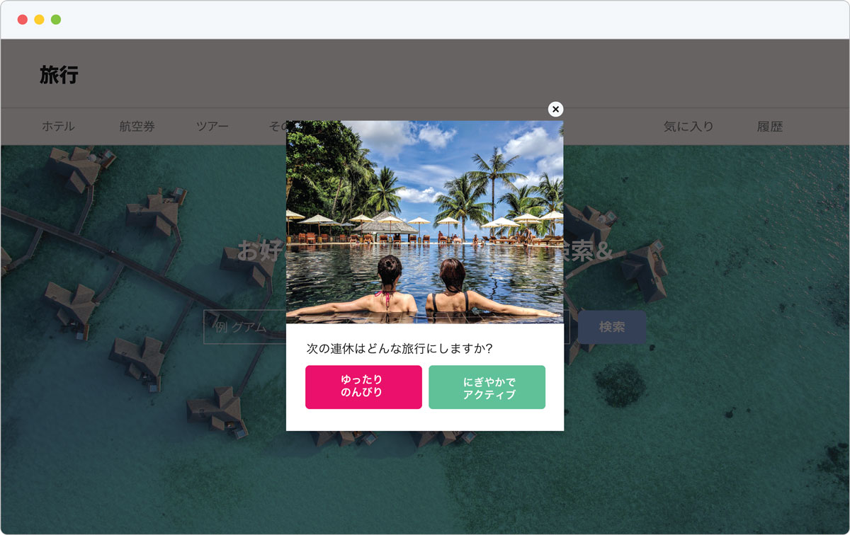
Fill out the below forms.
- Position
Choose the desired position based on the window from the following.
Top Left
Top Center
Top Right
Middle Left
Center
Middle Right
Bottom Left
Bottom Center
Bottom Right
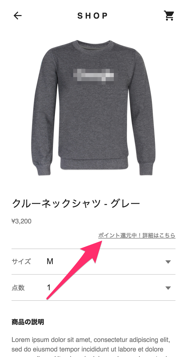
Fixed to specific element
Pop up (float) content for a specific element on the page.
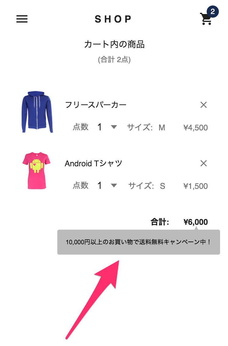
Fill out the below forms.
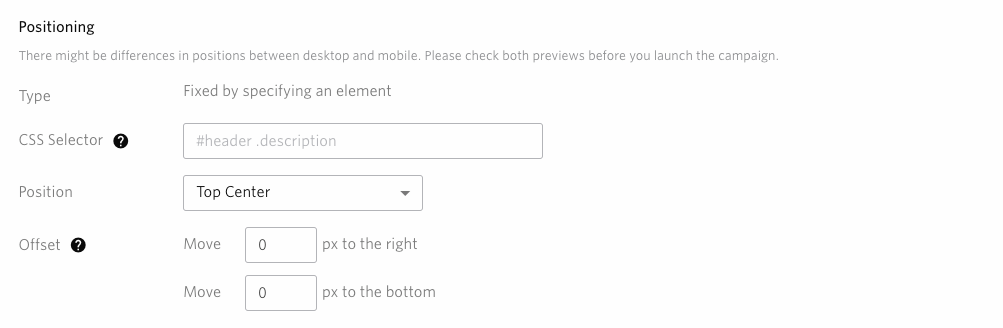
- CSS Selector
Use the CSS selector to specify the element for the display position. No message is displayed if the specified element does not exist when the display trigger is executed.
- Position
Choose which direction you want the message to appear from the reference element.
Top Left
Top Center
Top Right
Middle Left
Middle Right
Bottom Left
Bottom Center
Bottom Right
The position of the message to the reference element will vary depending on the selected position as shown in the following figure.
Gray square: Base element
Red square: message
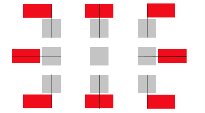
Example: When the position is set to ‘Top Right’
Horizontal: Place the reference element so that the center of the horizontal width is at the left edge of the message
Vertical: Arrange the top edge of the base element at the bottom edge of the message
- Offset
You can adjust the vertical / horizontal distance from the specified element in pixels.Values can be specified as negative or decimal.
Warning
Please note that if the message element overflows from the page width or height, the entire message may not be visible.
The setting on the display position is not reflected in the preview seen on the screen. Please use How to see the message preview to check the actual display position.
Embedded
Embed content before, after, or within specific element on a page.
Fill out the below forms.
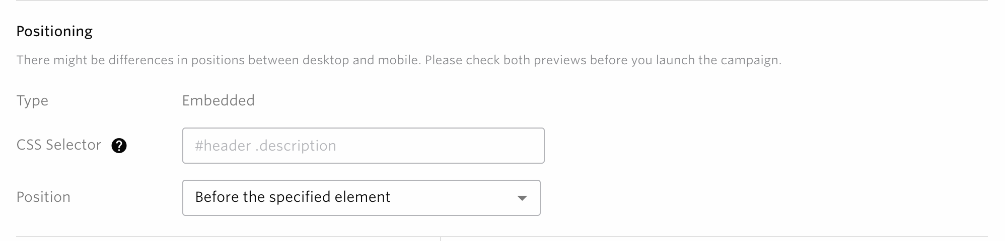
- CSS Selector
Use the CSS selector to specify the element for the display position. No message is displayed if the specified element does not exist when the display trigger is executed.
- Position
For the reference element, specify the position to place from the following.
Before the specified element
Before the first child of the specified element
Before the last child of the specified element
After the specified element
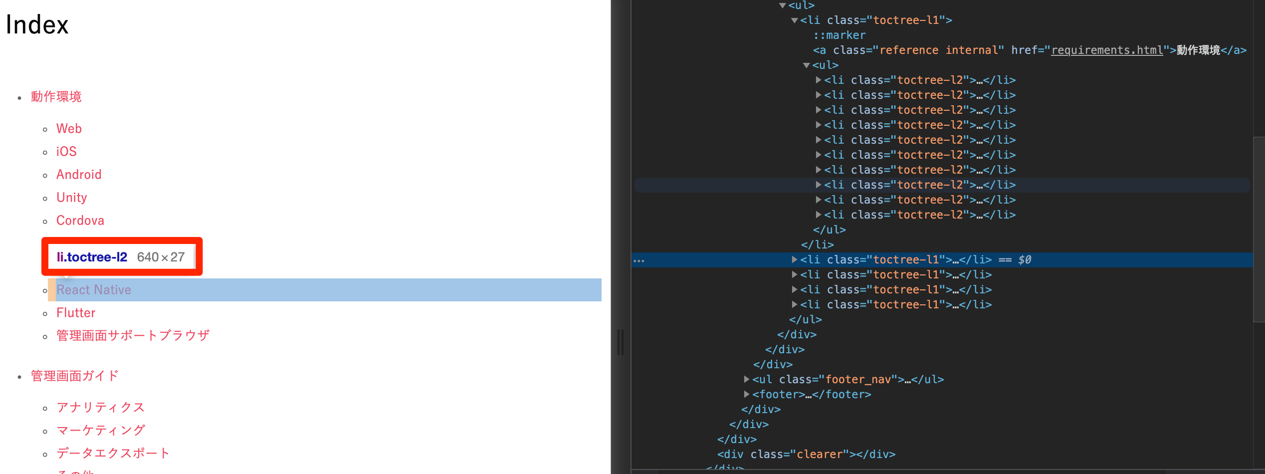
How to get the reference CSS selector
The following assumes that you are using Google Chrome as your browser.
1. Open Chrome DevTools
Press Ctrl+Shift+I(Windows)or Cmd+Opt+I(Mac) on the web page you want to embed. You will see a screen like the one below

2. Find the CSS selector for the target element
In the image above, you can see which elements in the Elements panel(Please refer to this for more detail.)correspond to which elements on your website. Using the name of CSS Selector(li.toctree-l2) which is shown in the red box in the following figure, Fill in CSS Selector field on the campaign creation screen.
Warning
The setting on the display position is not reflected in the preview seen on the screen. Please use How to see the message preview to check the actual display position.
Please make sure to use How to see the message preview to check the intended CSS selector is selected before the campaign is published.
Reflecting the Pattern Settings in the Control Group
When the Display Position is either ‘Fixed to specific element’ or ‘Embedded’ and you are using Control Group, note that the following pattern of settings will be applied to Control Group in order to measure the effects of the campaign more accurately.
The contents of Pattern 1 are also reflected in the control group.
e.g.) If Pattern 1 is set as follows, the same values will be reflected to the control group
Create contents
You can create contents and edit the selected template from the template selection screen
Depending on the template selected, the available settings and contents may differ. The different types and their respective contents are explained below.
Note
For items with the “INSERT VARIABLE” button, you can insert user profile values using Liquid notation. For details, see Personalization with Liquid.
DIALOG
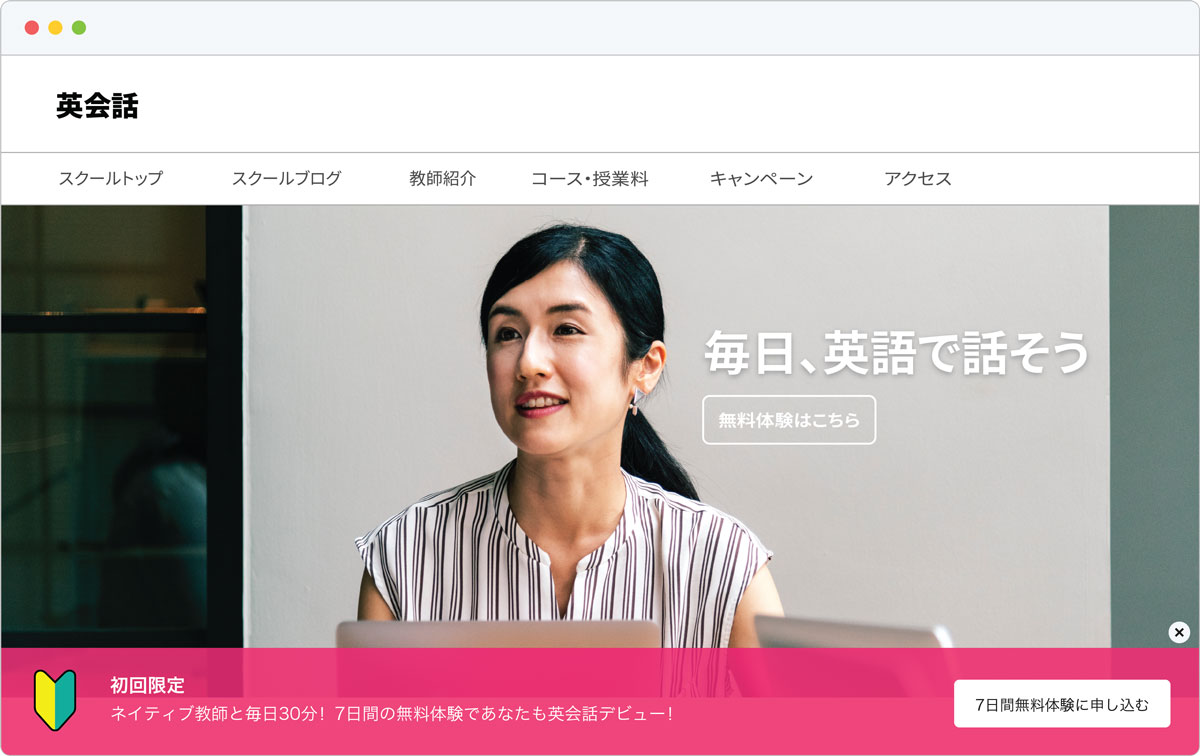
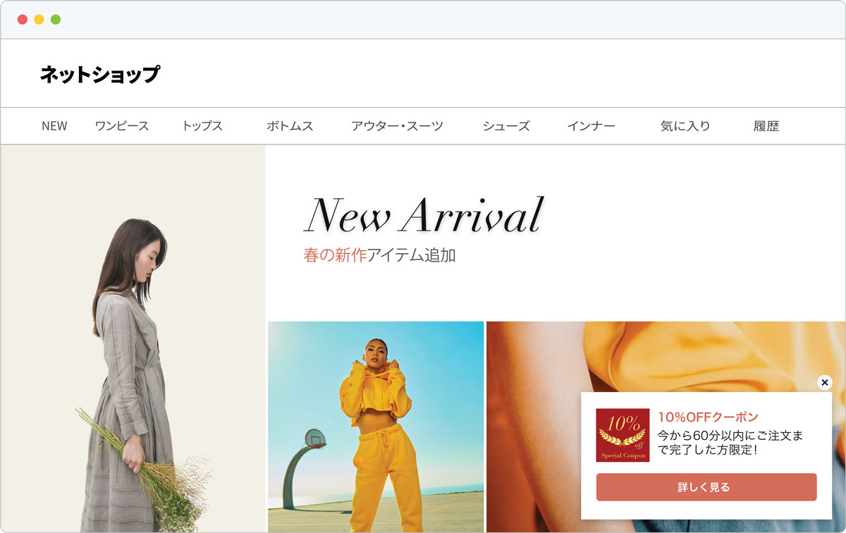
For Dialog type Web messages, you can create a message with customization options such as positioning and overlay toggling.This can be useful if you are delivering a EC coupon, survey, announcement, or any other content that you want the user’s full attention on
The available options differ depending on the template. For example, you can have one to four buttons that can be linked to other pages with Web URLs or Deep Links.
Fill out the below forms to create an Web Message:

DIALOG
Background Colors
You can specify the background color of the dialog.
Width
You can specify the width of the dialog, which can be an absolute value by px or a relative value by %.
Note
The maximum value for px is 640px, and the maximum value for % is 100%.
Padding
You can specify the top, left, bottom and right paddings between the content part and the border.
Border
You can specify the border’s color and width.
Corner radius
You can specify how much rounding should be applied to the corners of the border.
OVERLAY
When you create a message, you can decide whether to include an overlay when the message is displayed. This overlay will cover the entire screen with your message on top. By selecting an overlay, you can stop further actions from the user and draw their entire focus onto the message.If the user clicks a point covered by the overlay, the message with closed along with the overlay. You can also disable overlays by unchecking this option.
Background Colors
You can specify the background color of the dialog.
Close Button
You can create a message with or without a close button, set on the top-right corner of the message. If you choose to disable the close button, the user will still be able to close the message via the overlay.
Position
You can specify whether the close button should be inside or outside the dialog.
Background Colors
You can specify the background color of the close button.
Icon
You can specify the color of the close button’s icon.
Note
The user may NOT be able to close the message if you disable both the overlay and close button.
Header
Fill out the header text. You can also specify the text size/thickness/left-justified/centered/right-justified/color/spacing.
Message
Fill out the body text. You can also specify the text size/thickness/left-justified/centered/right-justified/color/spacing.
Note
Maximum number of characters for body and headings is 5,000.
Image(This is only displayed when you select a template to use images)
Select an image for the message. Templates will use one of three image sizes.
Supported file formats: JPEG, PNG
File size
Maximum: 1MB
Dialog with large image
Recommended: 600px x 500px or higher (Desktop & Mobile)
Dialog with small image
Recommended: 150px x 150px or higher (Desktop & Mobile)
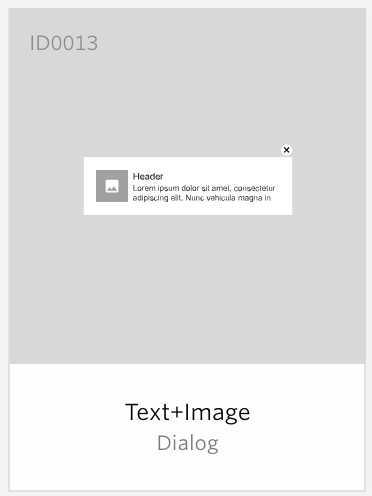
Image only
Recommended: 800px x 800px or higher (Desktop & Mobile)
Image customization items
Images can be configured with the following items
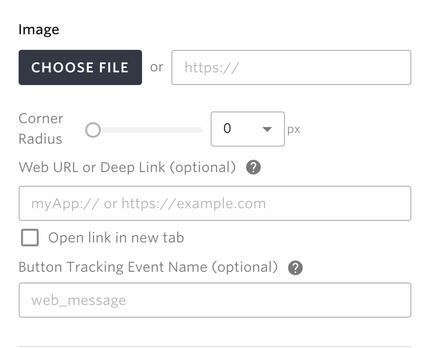
Corner radius
You can specify how much rounding should be applied to the corners of the image.
Web URL or Deep Links (Only available in some templates / optional)
Fill out the URL which will be opened when the image of the message is clicked. When this is left blank, the message will just close when the buttons are clicked.
Button Tracking Event Name (optional)
You can specify the name of the collected event when the button is clicked, which is available in campaign measurement.
Width
You can specify the width of the embedding, either in absolute px or relative to the width in %.
Button display(Displayed only when selecting a template that uses two or more buttons)
Padding
You can specify the paddings of the buttons.
Direction(This is only displayed when you select a template to use images)
You can choose whether you want the buttons to be aligned vertically or horizontally.
Button1/Button2/Button3/Button4(displayed only when you select a template that uses the button.
You can specify the text to be displayed on the button. You can specify the text size, thickness, left-justified, center-justified, right-justified, text color, button background color, white space, button border, and rounded corners of the border.
Note
The maximum text length of the button is 5000 characters
Web URL or Deep Links (optional)
If you specify a URL or deep link, when the button is pressed, you can open the page with the specified URL, launch the app, and navigate to any screen within the app. If you press the button without specifying a URL or deep link, the web message will be closed.
Note
If you don’t specify a URL or deep link, it may cause the screen to reload as it is treated as a transition to the same URL.
Character Limit
Maximum: 1000
Button Tracking Event Name (optional)
Specify the page URL to open once the button is clicked in the message. You can change the name of the collected event when the button is clicked.
Typical dialogues
Some of the most common dialog templates are listed below
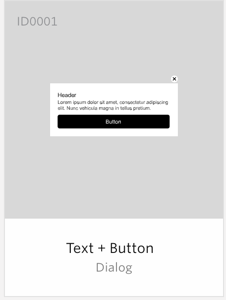
DIALOG(Text + Button)
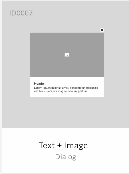
BANNER(Text + Image)
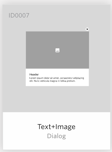
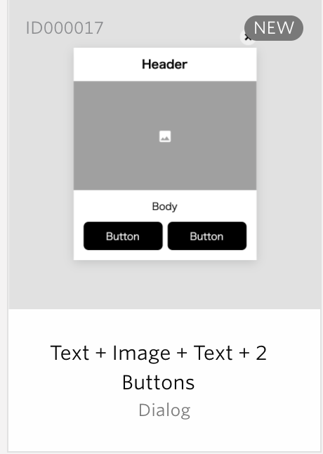
DIALOG(Text + Image + Two Buttons)
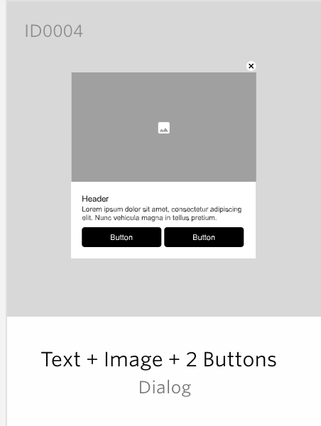
DIALOG(Text + Image + Two Buttons)
Speech Ballon
With the Speech Balloon Web Message, you can choose a particular element in the page by specifying a CSS Selector which will become the position basis of the message. For example, this can be used to show message on top of CTA buttons to increase conversions.
Fill out the below forms to create an Web Message:
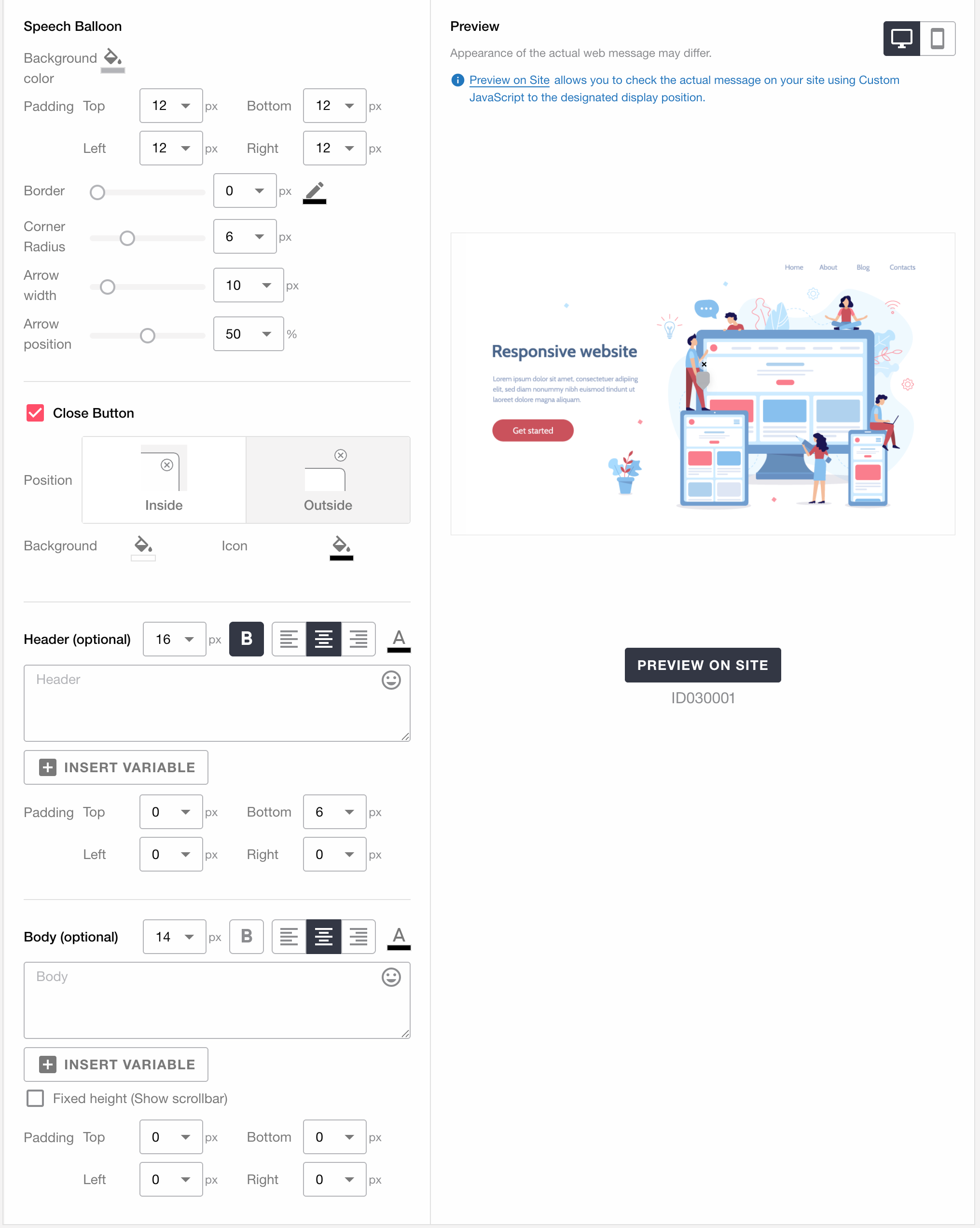
Speech Ballon
Background Colors
You can specify the background color of the speech ballon.
Padding
You can specify the top, left, bottom and right paddings between the content part and the border.
Border
You can specify the border’s color and width.
Corner radius
You can specify how much rounding should be applied to the corners of the border.
Arrow width
You can specify the width of the balloon’s arrow.
Arrow position
You can specify where the ballon’s arrow will appear to the left of the message
Close Button
You can select whether to display the close button on the message or not. The close button is placed at the top right of the message.
Position
You can specify whether the close button should be located inside or outside the balloon.
Background Colors
You can specify the background color of the close button.
Icon
You can specify the color of the close button’s icon.
Note
The user may not be able to close the message if you disable the close button.
Header
Fill out the header text. You can also specify the text size/thickness/left-justified/centered/right-justified/color/spacing.
Message
Fill out the body text. You can also specify the text size/thickness/left-justified/centered/right-justified/color/spacing.
Note
Maximum number of characters for body and headings is 5,000.
Embedded
With the Speech Balloon Web Message, you can choose a particular element in the page by specifying a CSS Selector which will become the position basis of the message. For example, this can be used to show message on top of CTA buttons to increase conversions.
Note
The embedded template will not close when the image or button is pressed.
Since the message is not closed, the number of button presses may increase in the measurement.
Fill out the below forms to create an Web Message:
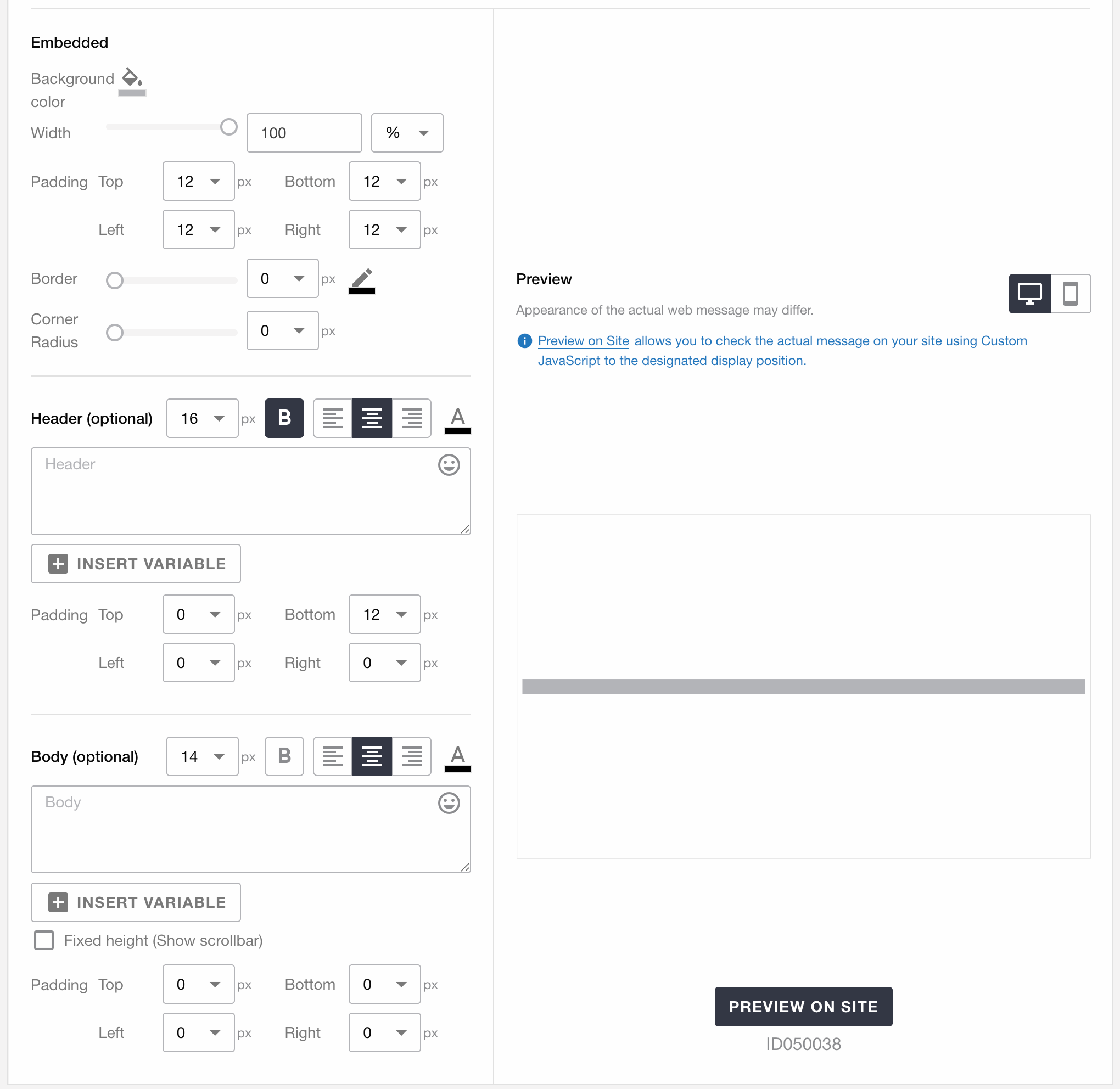
Embedded
Background Colors
You can specify the background color of the embedded area.
Width
You can specify the width of the embedding, either in absolute px or relative to the base element in %.
Note
The maximum value for px is 1440px, and the maximum value for % is 100%.
Padding
You can specify the top, left, bottom and right paddings between the content part and the border.
Border
You can specify the border’s color and width.
Corner radius
You can specify how much rounding should be applied to the corners of the border.
Header
Fill out the header text. You can also specify the text size/thickness/left-justified/centered/right-justified/color/spacing.
Message
Fill out the body text. You can also specify the text size/thickness/left-justified/centered/right-justified/color/spacing.
Note
Maximum number of characters for body and headings is 5,000.
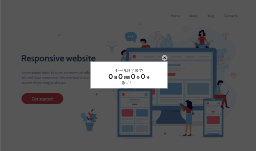
Countdown
Countdown type web messages can display the remaining time until the specified time. For example, in the case of an e-commerce site, you can display something like “3 days left until the end of the limited-time sale” to promote your CV.
The countdown template is combined with other templates to determine the basic look and feel of the countdown. The following templates can be combined. Please refer to the individual templates for details.
Countdown Setting
Set the timer to be displayed on the countdown.
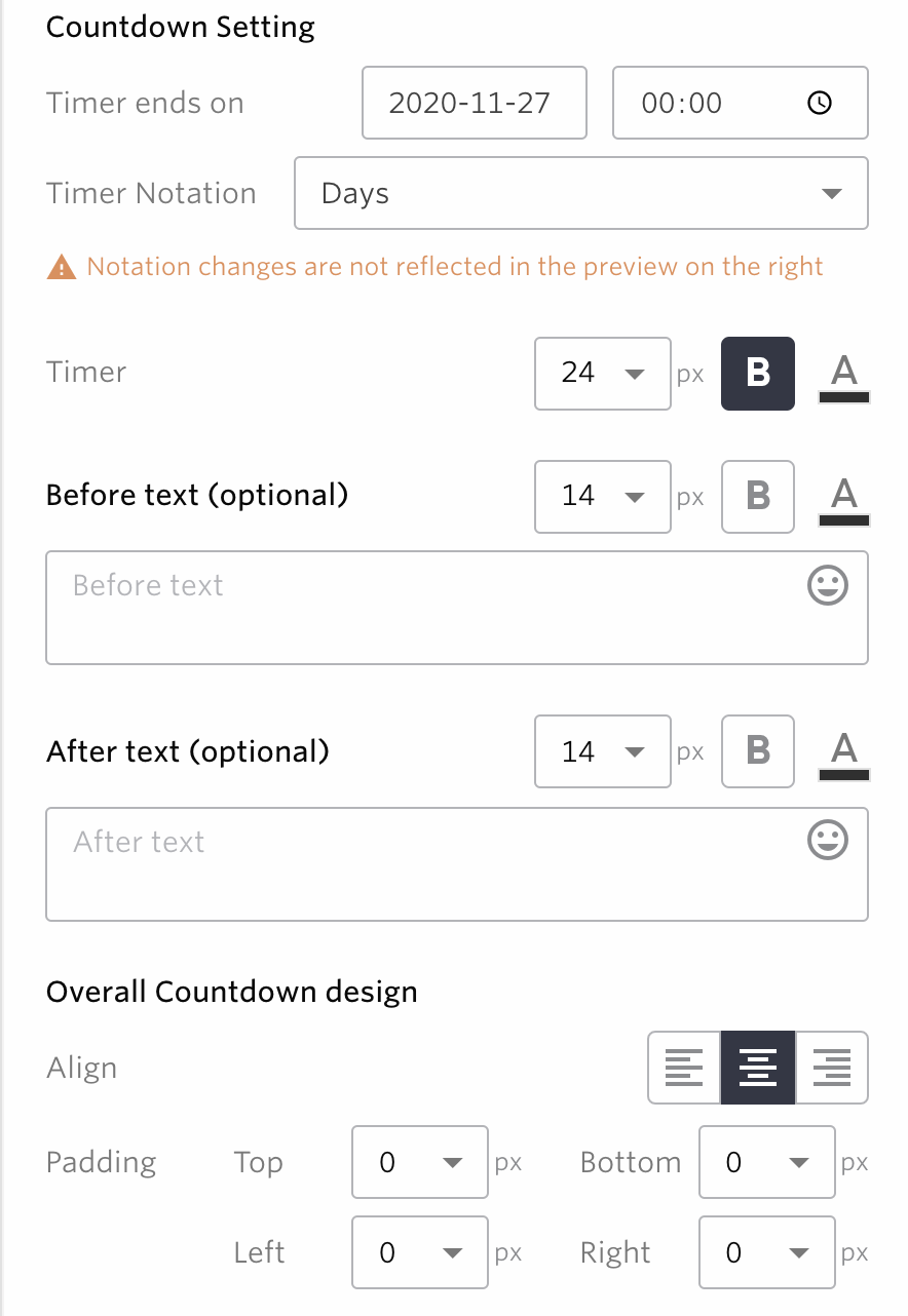
Timer ends on
You can specify the end time of the timer.
Timer Notation
Timer Notation
Date
Example: 3 days.
Days, Hours
Example: 3 days, 3 hours.
Days, Hours, Minutes
Example: 3 days, 3 hours, 59 minutes.
Days, Hours, Minutes, Seconds
Example: 3 days, 3 hours, 59 minutes, 59 seconds.
Timer
You can specify the size/thickness/left-justified/centered/centered/right-justified/color of the date/time of the timer.
Note
If the campaign has not ended after the end of the countdown, a 0 will be displayed according to the date and time notation, as shown in the figure below. For example, in the example below, the date/time notation is “day, hour, minute, second”, so “0 day0 hours, 0 minutes, 0 seconds”.
Note
The unit in which the timer is actually displayed is determined by the lang attribute of the HTML element of the website in question.
For example, if you use days, hours, minutes, and seconds to describe a timer, and the lang attribute of the HTML element of the website in question is “en”, it will display something like 1days 3hors4minutes 3seconds.
For the lang attribute of the HTML element, Please refer to the official site
Before Text
You can specify the text that comes before the date and time of the timer. Using the example above, this corresponds to the ‘until the end of the sale’ section.
You can specify the size, thickness and color of the text.
After Text
You can specify the text that comes after the date and time of the timer. Using the above example, this corresponds to the “Hurry up” part.
You can specify the size, thickness and color of the text.
Overall Countdown design
You can specify left-justify, center-justify, and right-justify/margin for the entire countdown.
Note
If you are using a custom message in a countdown template, Please be careful not to accidentally delete the data-repro-template–countdown-wrapper attribute. The measurement will not work correctly.
Sticky bar
Sticky bar type web messages are always placed in a fixed position at the top or bottom of the website and can follow the user’s page scrolling.
For example, it can be used in use cases where you want to prompt end users for important information or actions, such as cookie permission.
Sticky bar
Set the position and background color of the sticky bar template.
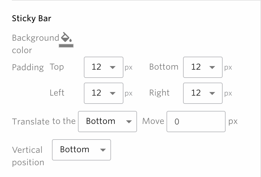
Background Colors
You can specify the background color of the sticky bar.
Padding
You can specify the top, left, bottom and right paddings between the content part and the border.
Position
The position of the sticky bar can be adjusted vertically.
Vertical Position
You can specify whether to display the sticky bar on the top or bottom.
Icon
With icon-type web messages, for example, an icon like Twitter’s Like button can be constantly displayed in the lower right corner of a website to encourage users to take action.
Display Position
Position
Choose where to display the icon on the website from 9 options, including top left/top.
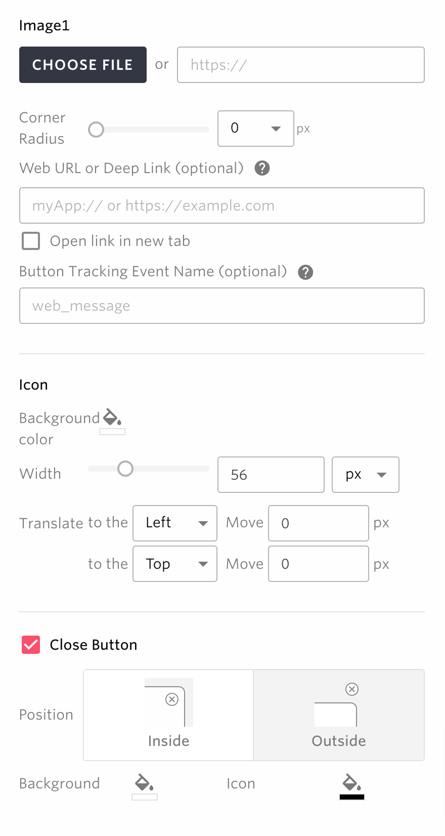
Image1
Set the image used as icons.
Corner radius
You can specify how much rounding should be applied to the corners of the image.
Web URL or Deep Links (optional)
You can set the transition destination when the icon is clicked.
Tracking Event Name (optional)
You can set the name of the event that will be tracked when the icon is pressed.
Icon
Background Colors
You can specify the background color of the icon.
Width
You can specify the width of the icon, either in absolute px or relative to the base element in %.
Position
The position of the icon can be adjusted both vertically and horizontally.
Close Button
Close Button
You can select whether to display the close button on the message or not. The close button is placed at the top right of the message.
Position
You can specify whether the close button should be inside or outside the icon.
Background Colors
You can specify the background color of the close button.
Icon
You can specify the color of the close button’s icon.
Use Campaign as a newsfeed
msgstr “If you check the “Use campaign as newsfeed” checkbox in the Campaign settings , an input form for the newsfeed will appear below the form for content creation, as shown in the image below, and can be configured. See Newsfeed.

- Title
Specifies the title of the NewsFeed. The value entered here can be retrieved as the
titlein the NewsFeed.- Summary
Specifies the summary of the NewsFeed. The value entered here can be retrieved as the
summaryin the NewsFeed.- Detail (optional)
Specifies the body of the NewsFeed. The value entered here can be retrieved as the
bodyin the NewsFeed.
Link URL(optional) Specifies the link url of the NewsFeed. The value entered here can be retrieved as the link_url_string (SDK) or link_url (NewsFeed API) in the NewsFeed.
Image(Optional) Specifies the image url of the NewsFeed. The value entered here can be retrieved as the image_url_string (SDK) or image_url (NewsFeed API) in the NewsFeed.
How to see the message preview
You can check how the message would look on your website before actually sending it to users using the preview feature.
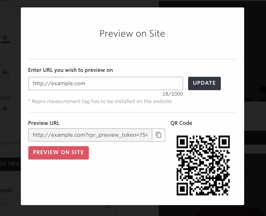
When using preview for the first time
Click on the ‘PREVIEW ON SITE’ button in the web message form.
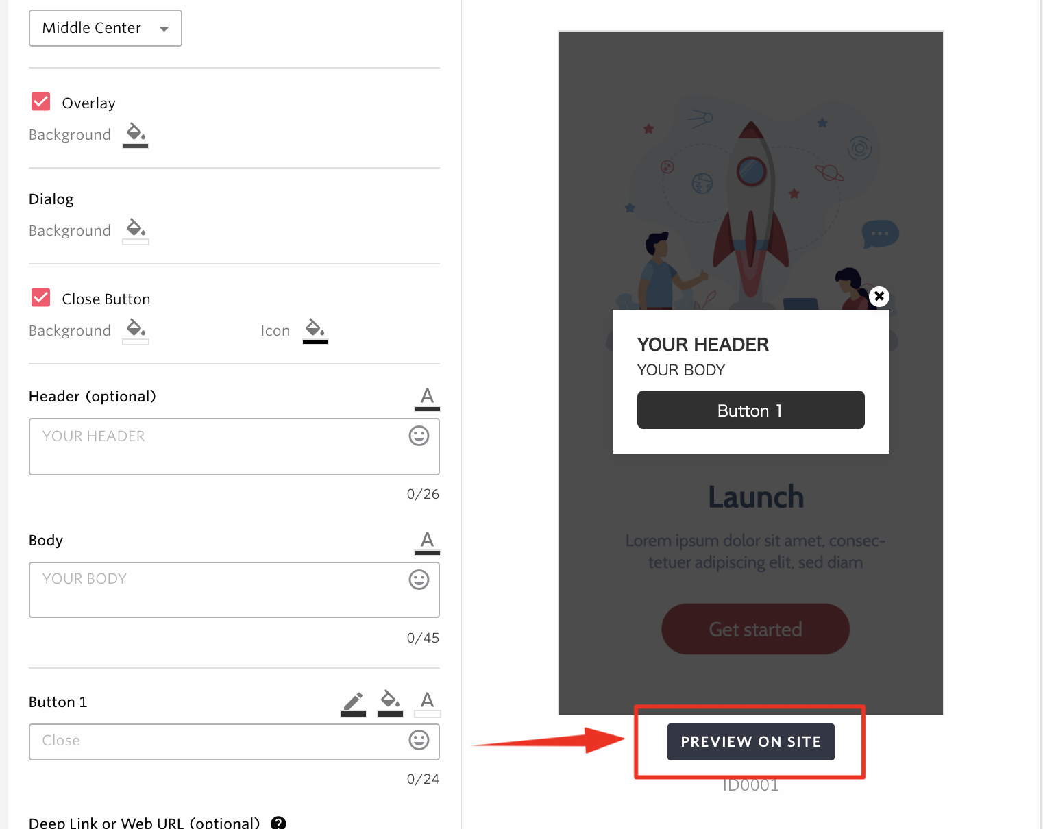
Fill in the URL you wish the message to be displayed and press the ‘SAVE’ button.
Open the preview URL by either clicking the ‘PREVIEW ON SITE’ button, copying and pasting the generated URL or scanning the QR code of the URL.
Once you open the preview URL, the message you were editing will be shown.
When using preview after the first time
Click on the ‘PREVIEW ON SITE’ button in the web message form.
The URL which had been saved will be prefilled to the field. You can modify the URL and press ‘UPDATE’ to change the URL.
Open the preview URL by either clicking the ‘PREVIEW ON SITE’ button, copying and pasting the generated URL or scanning the QR code of the URL.
Once you open the preview URL, the message you were editing will be shown.
Note
If you want to reflect the changes made to the message content to the preview, press ‘UPDATE’ button and reload the preview page.
When the preview URL is opened on your site, Web SDK will not track events nor show other messages than the preview. The Web SDK may log message to the browser’s console while viewing the preview message, but this has no effect on the site’s behavior.
The generated preview URL does not have expiry date.
Conditions associated to the message such as the display Trigger Event or Target users will not take effect on the preview. When you open the preview URL, you will always see the preview message.
The preview message will not be shown unless the version of the Web SDK you have installed is higher than version 2.
Some sites drop query parameters by performing a redirect or the JavaScript library that is used may do so. Please note that in such cases the preview message may not appear.
Custom Message
Please refer to Custom Message
Distribute Users Among Variants
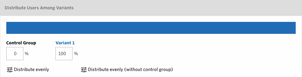
Distribute target users among Control Group and message variants as configured in Target Users. Control Group refers to the group of users who will not receive the message in order to see how effective the message was by comparing the results between users who received the message and who did not.See A/B Testing for more details how to change the settings with additional variants.
For example, when sending to Existing Users with Control Group set to 20% and Variant 1 to 80%, 80% of the users randomly chosen from all of the users will receive the message while the 20% rest will not.
Set distribution percentages
By default, Control Group is set as 0% and Variant 1 is set as 100% which will make all of the target users receive the message. If you do not wish to use the Control Group, you can leave these settings as is. If you want to use the Control Group then you can adjust the percentages with the total being 100%.
You can assign 50% each to Control Group as well as Variant 1 by clicking Distribute evenly, while Distribute evenly (without control group) will make Control Group 0% and Variant 1 100%.
Note
Control Group’s percentage can be anything between 0% and 99%.
Variant 1’s percentage can be anything between 1% and 100%.
Only integers can be set.
Changing the distribution settings is not possible after a campaign has been saved.
The actual number of message delivery may fluctuate depending on the volume of the target user.
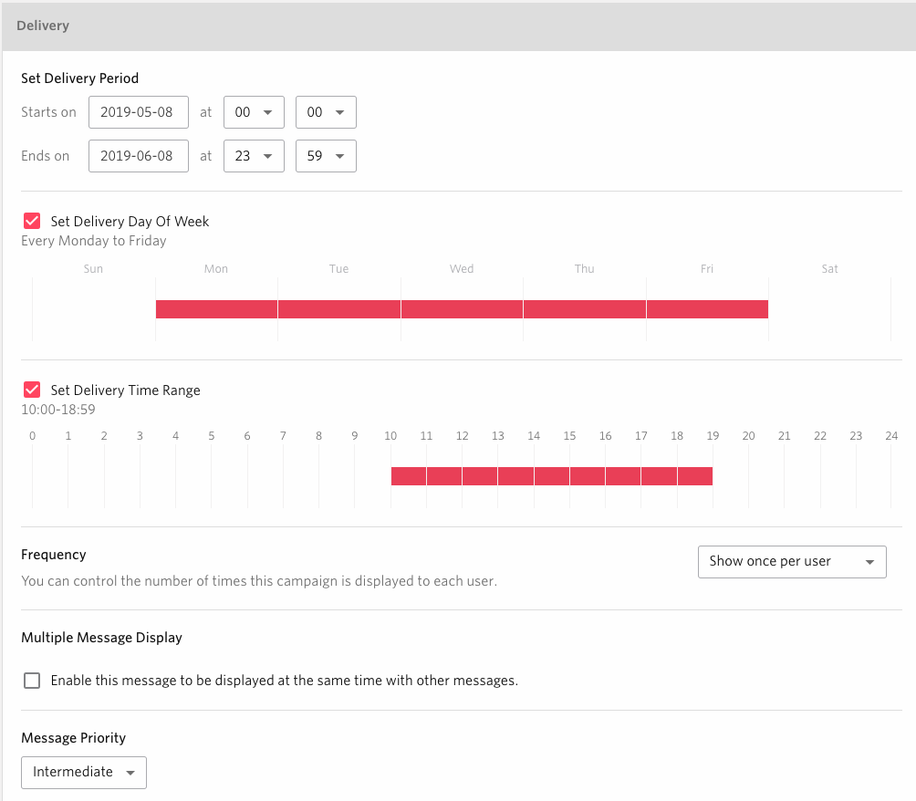
Delivery Type
- Delivery period
Set the period of time you want the campaign to be delivered to your users. The message will be shown once per user during this period. Users are identified by User ID.
- Set Delivery Days
You can specify the delivery day(s) of the week. By specifying certain day(s) of the week, the message will only be delivered on those day(s). If not specified, delivery will occur on all days of the week.
- Set Delivery Time Range
You can specify the delivery time range. By specifying certain time range, the message will only be delivered within those time range. If not specified, delivery will occur at anytime.
- Display Frequency
For each campaign, you can control how many times each user receives a message. For multiple occurrences, you can control the cumulative total (maximum of 2~10 times or unlimited) and further restrict the maximum number of occurrences a day (1~10 times) for each user.
Note
If “First-time Users” has been selected as the Target Users, the frequency can only be set to either once or unlimited.
If you allow showing messages an unlimited number of times per day, they may be displayed more than the number of times you specify, depending on our system condition.
Warning
If you allow a user to receive the message multiple times, the message is not displayed until Repro internally detects that the message has been displayed.
- Multiple Message Display
You can specify whether to display this message alongside other messages with the same PV by checking “Enable this message to be displayed at the same time with other messages”. By default, this feature is disabled.
Note
In the case of messages between simultaneous display disabled, only one of them is displayed on the same PV.
In the case of two or more messages with the same PV and simultaneous display disabled, the one most recently updated will be displayed.
For example:
Message A |
Message B |
Delivery Result |
|---|---|---|
Disabled |
Disabled |
Only one of A and B is displayed |
Enabled |
Enabled |
Both A and B messages will be displayed |
Disabled |
Enabled |
Both A and B messages will be displayed |
- Message Priority
In the case of a message with simultaneous display disabled, the priority can be specified as a number from 1 to 100, and larger numbers are displayed preferentially. The default value is 50.
Note
- The following rules will determine which message is displayed first when multiple messages with simultaneous display disabled are specified at the same time.
Messages with higher priority are given priority.
For messages with the same priority, the most recently updated message is given priority.
For example:
- If the message display trigger has the same display conditions as below,
Message A - “80” Priority - Display only once per user
Message B - “50” Priority - Display only once per user
- It will be delivered as follows.
1st access - Only Message A is displayed
2nd access - Only Message B is displayed
Note
- The priority levels previously set as “High, Intermediate, Low” prior to this release have been updated as follows:
Low: 30
Intermediate: 50
High: 80
Message Display Trigger
The display timing of messages can be controlled by the message’s trigger. You can choose the timing based on your use case.
Note
If you want to trigger it under new conditions not using an existing event, you can click Create new event to create a new event from the event selection.For more information about the entry , check here.

Trigger messages by event trigger
Trigger the display of message when the selected event is triggered.
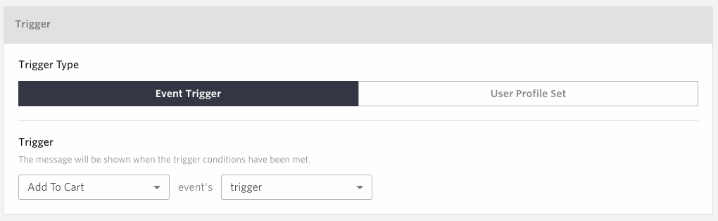
- Trigger Type
Select Event Trigger
- Trigger
Select an event from the first list.
Select “Trigger” from the second list.
Trigger messages by the number of occurrences of the triggered event
Trigger the display of message when the selected event is triggered for specified number of times.
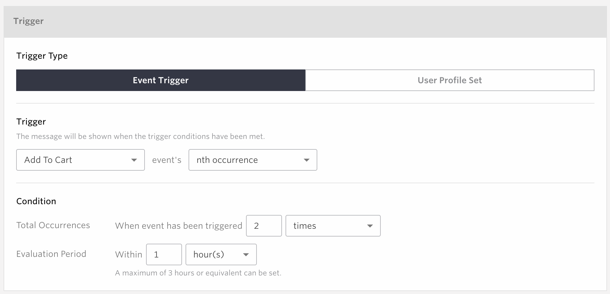
- Trigger Type
Select Event Trigger
- Trigger
Select an event from the first list.
Select nth occurrence from the second list.
- Condition
Total Occurrences
The range for value which can be specified is from 2 to 30.
Comparison method can be chosen from either “times“ , “or more times“ , “or less times“
Evaluation period
The Evaluation Period can be chosen from either “a session“ , “hour(s)“ , “minute(s)“ , “second(s)
Note
If you choose Time Range, the time for the Evaluation Period can be set up to 3.
The period of time will be backdated to the point where the event is newly executed ( For example, If an event is executed at 3/15 15:00, and if the period is 3 hours, then after 3/15 12:00 is counted.
Trigger messages by the value of event property
Trigger the display of message when the specified event property has a certain value.
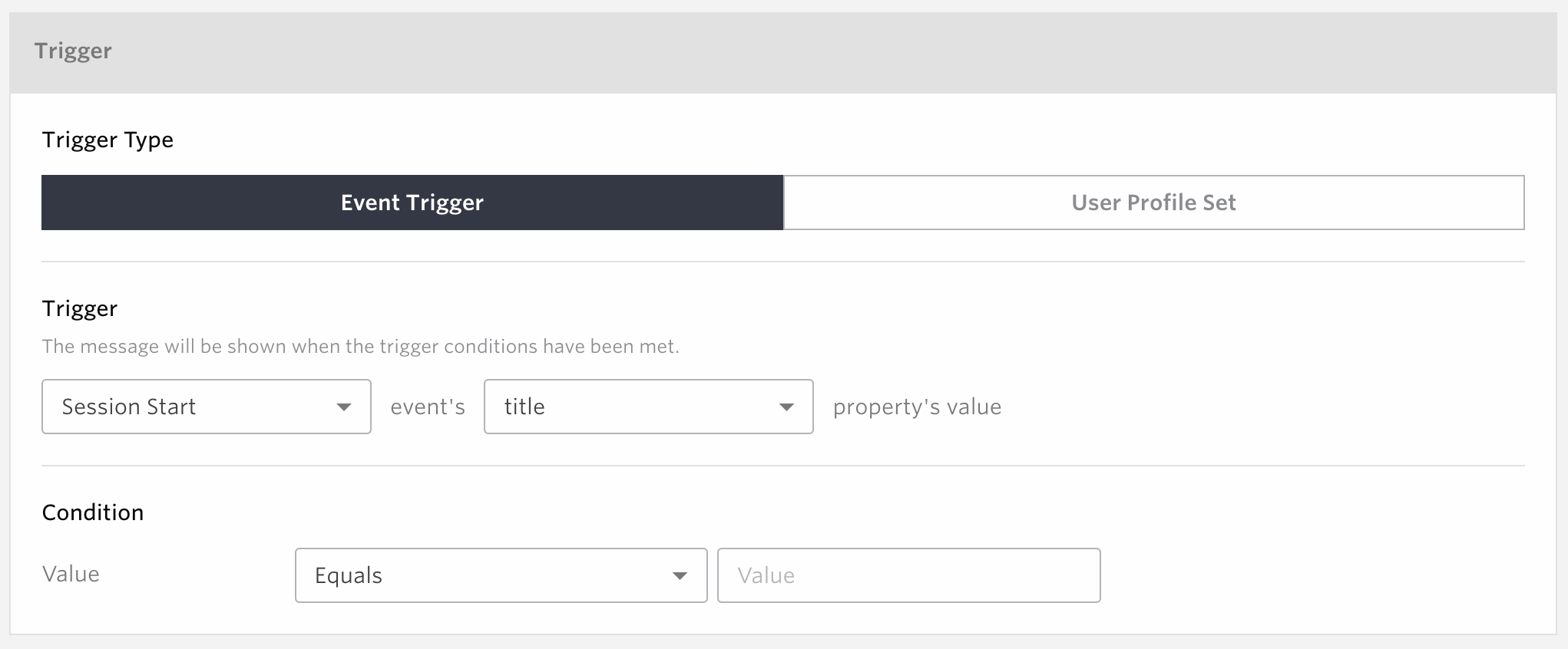
- Trigger Type
Select Event Trigger
- Trigger
Select an event from the first list.
Select the key for an event property from the second list.
Select “Trigger” from the second list.
- Condition
Specify the value for the condition of event property
The comparing method can be chosen from either “equals”, ”does not equal”, ”is any of”, ”is more than or equals (number)”, ”is less than or equals (number)”, ”contains (text)”, ”does not contains (text)”, ”matches regular expression”, ”matches regular expression(ignored case)”, ”does not matches regular expression”, or ”does not matches regular expression(ignored case)”
Note
If you select conditions that use Regular Expression such as
matches regular expression, the given value will be passed as the argument ofnew RegExp()and be used to check if it meets the condition. Please refer to MDN’s documentation for more details about Regular Expressions.Please check Handling of Values in Event Trigger and Web Message Display Conditions for more information on how comparisons are made to JavaScript objects.
Trigger messages by the value of event property
Trigger the display of message when the User Profile is set to the specified value.
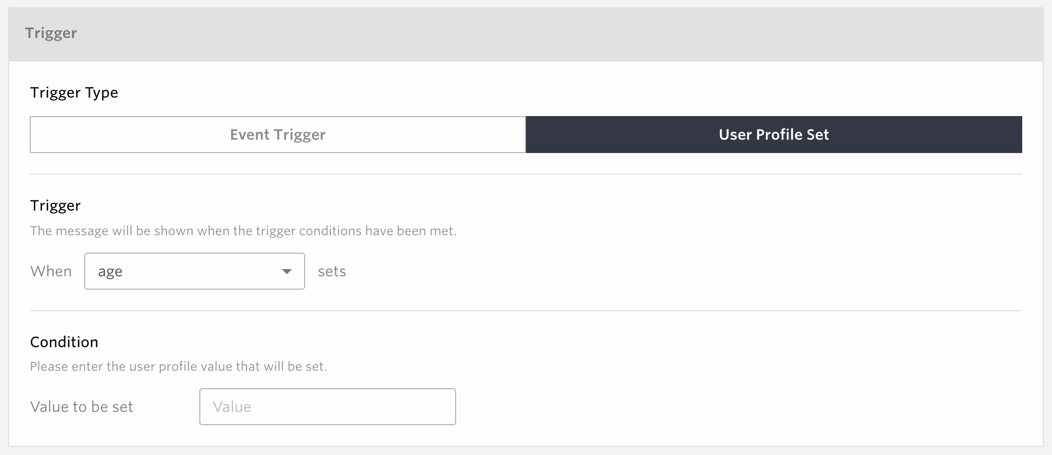
- Trigger Type
Select User Profile Set
- Trigger
Specify the User Profile.
- Condition
Value to be set
Specify the value to be set.
It triggers only when the value matches.
You cannot specify the value before the change in the condition.
Even if the value is set to the same value as before, it still triggers when the value matches the condition.
Warning
For Web SDK version 2.26.1 or earlier, the trigger will execute even if a matching value is set via conditional set operation for user profiles, or if the user profile increment/decrement value matches the set value. Please be aware.
Note
From Web SDK version 2.26.2 onwards, the trigger will not fire even if a matching value is set via conditional set operation for user profiles, or if the calculation result matches via user profile increment/decrement.
Target Users

You can target all existing users or a segment of users by filtering with events or user profiles with the filters. The filters can be combined as either and , and not, or condition up to 5 in total.
and: Add the users to the delivery target who match all the specified condition.
and not: Exclude the users from the delivery target who match the specified condition.
or: Add the users to the delivery target who match any of the specified condition.
For example:
When delivering to users who have used the app 3 days ago, but have not done so for 2 days since then
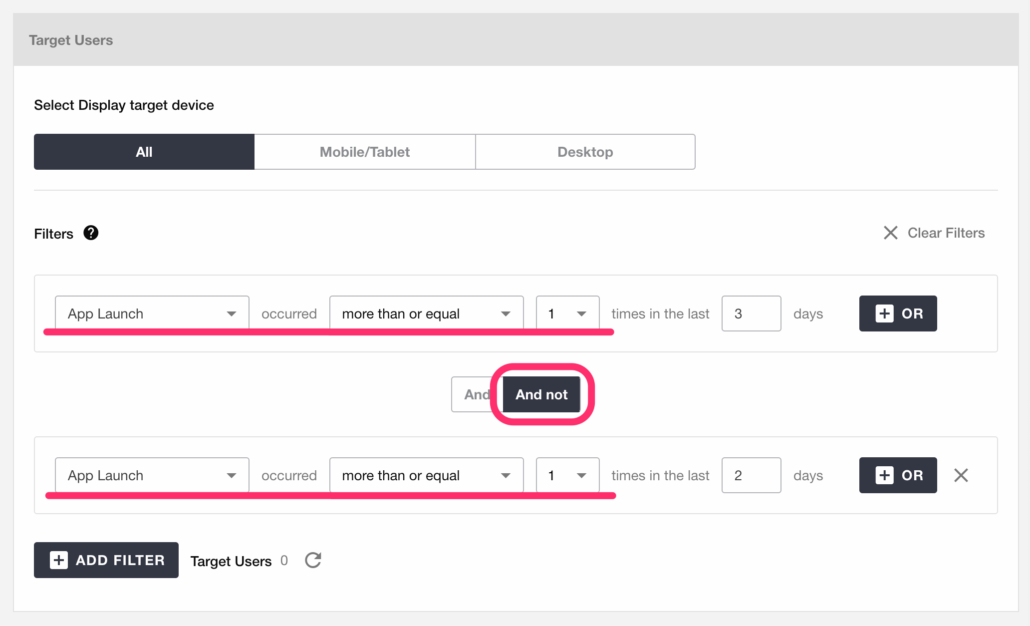
When delivering to users whose gender is female and have performed either Event A or Event B within the last 3 days
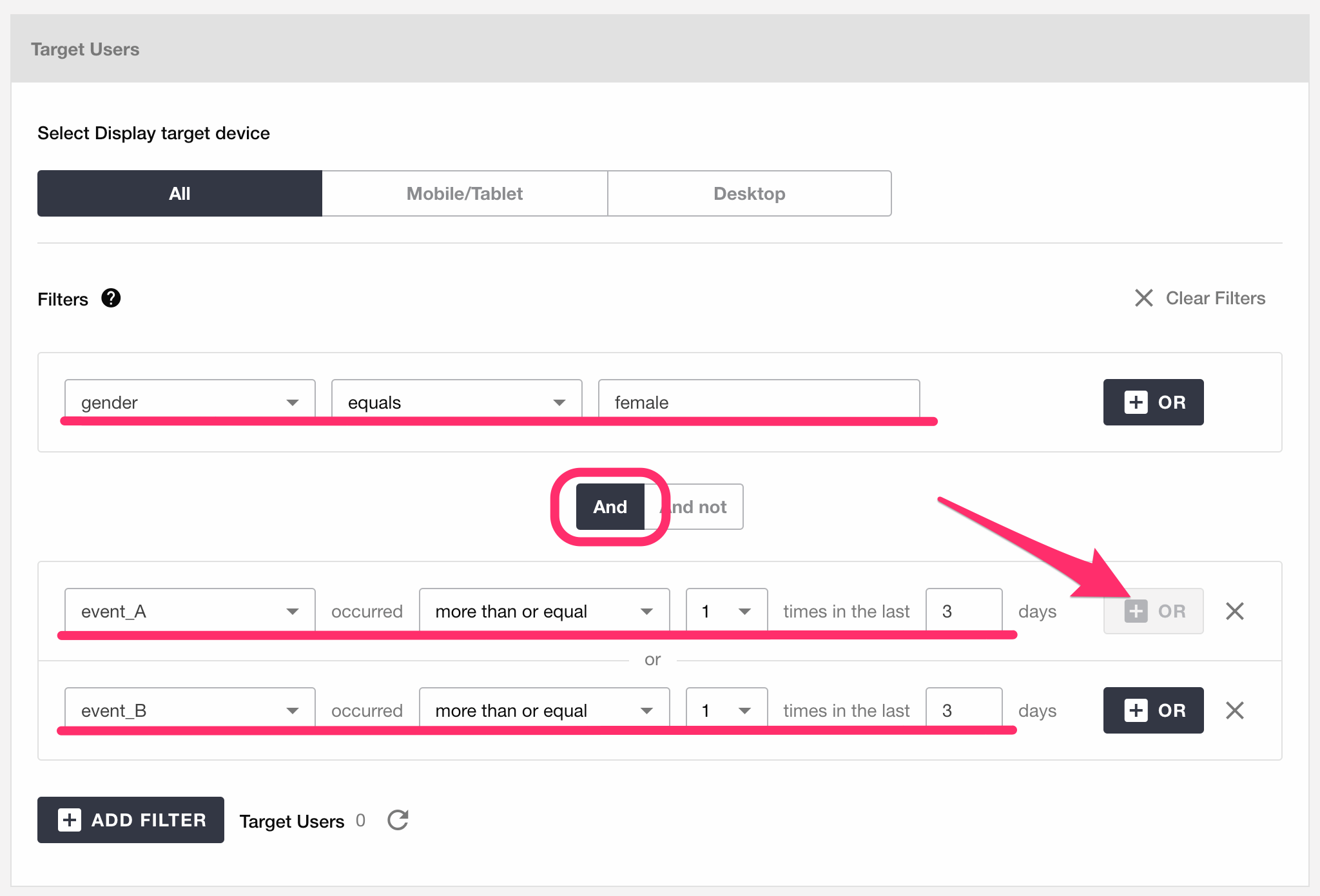
Select Display target device
Deliver web message to users accessing on All or Mobile/Tablet or Desktop.
Filtering with audiences
You can segment the target by using existing audiences created as explained in Audience
Note
Filtered Audience: This audience cannot be combined with other filtering conditions.
Import Audience: This audience can be combined with other filtering conditions.
Filter with Events
You can segment the target by the usage of the events, specifying how many times an event has been done within certain period.
Filter with Event Property
You can segment the target by the usage of the events and its associated properties, specifying the property name, value, and how many times an event has been done within a certain period.
Filter with User Profile
You can segment the target by registered user profile data. If you specify a numeric value for the profile type in SDK, you can use ‘greater than, less than’ etc. to specify the conditions under which the values are compared. If you specify characters, you can specify conditions for comparing values using ‘match, not match, include’ and so on. If a date is specified, the condition can be specified using ‘before Fat day, Fat day to day, before specific date,’ etc.
Please refer to the FAQ on the Support Site for a detailed explanation of date specifications.
All Users
A campaign will be delivered to all users regardless they are registered to Repro or not.If you use this filter, You can not use other filters at the same time .
First-time Users
A campaign will be delivered to users who have accessed the web page for the first time, where Repro Web SDK is embedded. Please note that the segmentation for First-Time users is only valid within their first session, which is from the point users start their session till 30 minutes after the last event is fired by them.
An example when a campaigns for First-Time users is not received by (first time) users
5 / 1 19:00 An user visited the website for the first time and fired first event A.
5 / 1 19:31 An user fired the second event B
Please note that in the case above, You can’t deliver the campaign to the users using the event B as the Event Trigger with the segmentation filter of First-Time users.
Existing Users
The campaign will be delivered to all the existing users registered to Repro. If you wish to exclude users who match special conditions, please add desirable filters using combined as and not.
Save As Draft
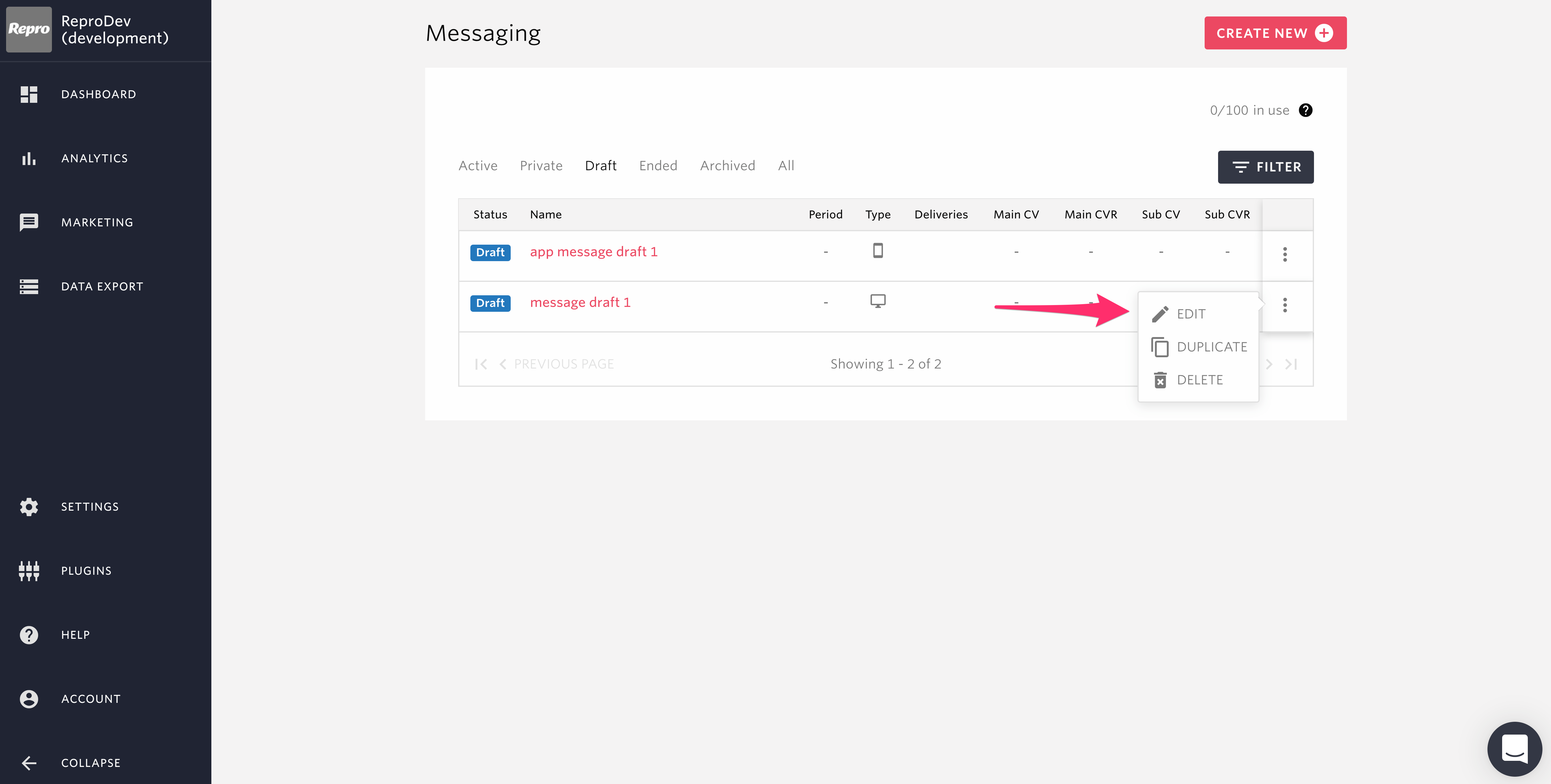
To save an incomplete campaign, such as when all the required fields have not been filled out, please click the SAVE AS DRAFT button. For campaigns that are saved as draft, it is still possible to change all fields including the Campaign Goal and Variants.
You can access your drafted campaigns from the “Draft” tab on the Messaging homepage.
To Launch or Launch As Private
Before clicking the “LAUNCH” or “LAUNCH AS PRIVATE” button, please carefully check the contents of the campaign. After a campaign has been launched or launched as private, it is no longer possible to change the Campaign Goal or Variants.
Once your campaign is ready to be launched, please click the LAUNCH or the LAUNCH AS PRIVATE button.
Campaign Measurement
You can check the effectiveness of the campaigns.
Delivery Result
- Deliveries
Total number of users who saw the delivered message on a daily basis.
- Conversions
Number of total users who have performed the campaign goal event set from the creation page within 24 hours on a daily basis.
- Conversion Ratio
Number of conversions divided by deliveries.
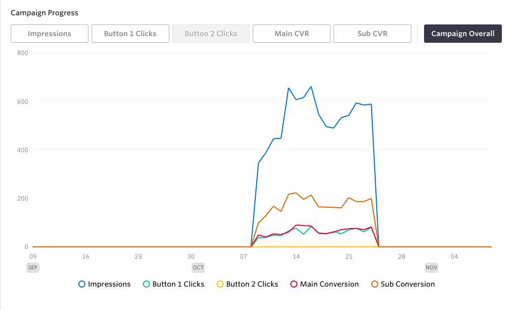
- Campaign Progress
Results of the deliveries, opens and occurrence of the campaign goal event on a daily basis: Note that the results represent the number of users.
A/B Testing
A/B testing allows you to see what kind of content drives better conversion rate by delivering different patterns of the message to divided group of users.
You can also keep the most effective pattern from the A/B testing as the winner of the campaign and only delivery the selected variant.
Create Message
By composing a message with two or more variants, an A/B-Test can be performed.
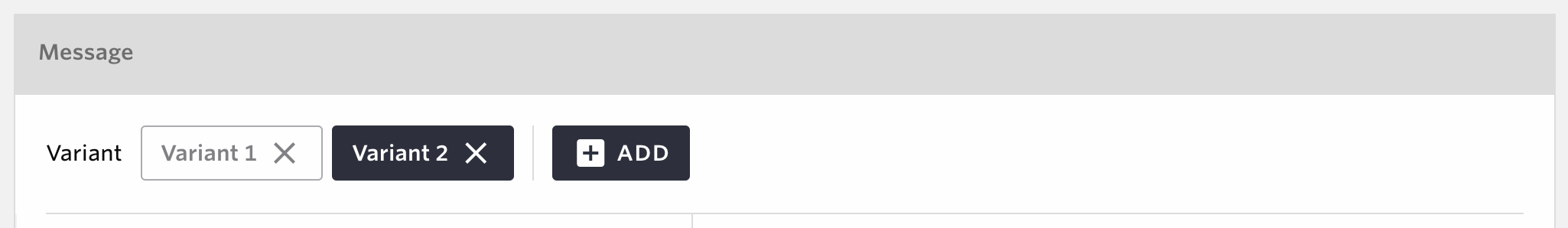
You can create up to 4 different patterns.
Adding or removing message variants is not possible after a campaign has been saved.
Distribute Users Among Variants
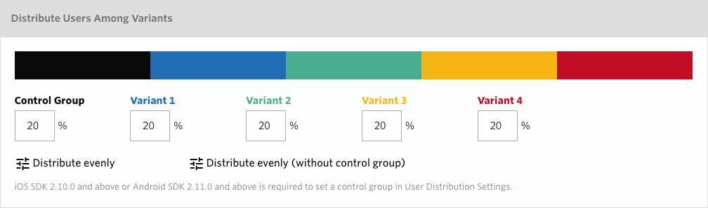
Distribution percentages can be individually adjusted when having more than 2 variants making the total 100%.
You can assign equal percentages to Control Group as well as each of the variants by clicking Distribute evenly, while Distribute evenly (without control group) will make Control Group 0% and make percentages even among multiple variants.
Note
Control Group’s percentage can be anything between 0% and 99%.
Each of the variants’ percentage can be anything between 1% and 100%.
Only integers can be set.
Changing the distribution settings is not possible after a campaign has been saved.
The actual number of message delivery may fluctuate depending on the volume of the target user.
Campaign Measurement (A/BTest)
Details screen
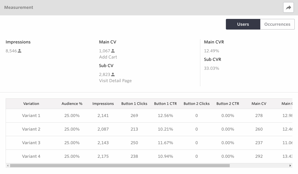
You will see the results after a while from the delivery. The charts will show the number of deliveries, button clicks and the conversion rate of each of the patterns. Please see Analytics results aggregation for more details about when the campaign results will be updated.
Note
The overall numbers of Deliveries, Conversions and Conversion Rate will exclude results of Control Group to make it easier to see how effective the campaign itself had been.
Users who belong to Control Group will not receive the message, so the results of Delivery, Button 1 Clicks and Button 2 Clicks will always be shown as -.
The number of Conversions of Control Group shows how many times the campaign goal event had been done among the users who belong to Control Group.
The number of Conversion Rate of Control Group is calculated dividing number of Conversions by the number of users who belong to Control Group.
The elements displayed on the effectiveness measurement screen differ depending on the type and elements of the template used. Please refer to the following for details. Note that Standard in the table corresponds to all templates excluding original one in the template selection screen, while custom refers to the case where a custom message is used.
Standard |
Custom Message |
|
|---|---|---|
Displayed items |
It varies depending on the elements used in the templates. (For example, in a template that uses two buttons and two images, the effect measure will show Button 1 / Button 2 / Image1 / Image2 will be displayed.) |
Button 1 / Button 2 / Button 3 / Button 4 / Image 1 / Image 2 / Image 3 / Image 4 are displayed regardless of the elements used in the template. |
During the A/B test, the results of the test will be displayed. Here, you will be able to compare the markers (Button1 CTR, Button2 CTR, Main CVR, Sub CVR) that have selected different patterns, including the control group.
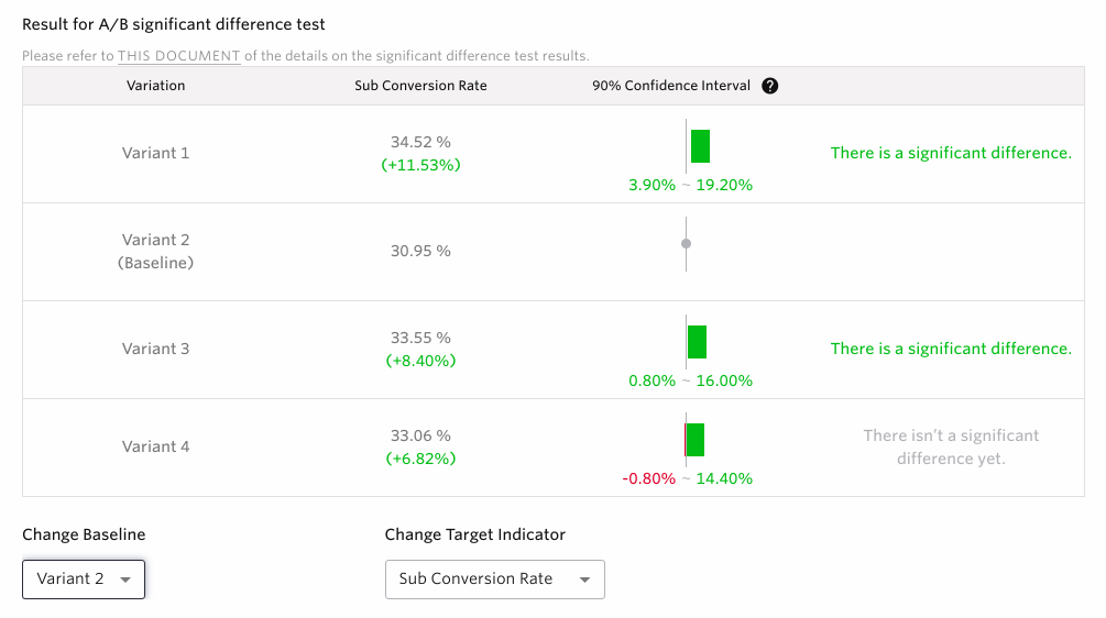
Pattern
Each pattern used to deliver the A/B test, including the control group, will be displayed here.
Baseline
Here, you will be able to select the baseline pattern that will be used as the standard when comparing each pattern. By changing the baseline, you will be able to compare between a variety of different patterns.
Targeted indicator
An indicator is used when comparing patterns to baselines in A/B tests. You can select a ratio value (i.e. Button1 CTR, Button2 CTR, Main CVR, Sub CVR) as the indicator. Also, the indicators listed can be changed through the editing page.
90% confidence interval
The 90% confidence interval will be displayed when each pattern is compared to the baseline. For the definition of 90% confidence interval, please see the FAQ. Here, we will talk about the most common ways to recognize patterns.
Pattern 1:

When displayed as such, it means that the difference between the pattern and the baseline is significant. We recommend moving onto the winner pattern if enough time has passed since delivery.
Pattern 2:

When displayed as such, it means that the difference between the pattern and the baseline is not significant. Either wait until the results appear or consider moving on to the next campaign if enough time has passed since the delivery.
Pattern 3:

When displayed as such, it means that the difference between the pattern and the baseline is significant. If this is the only window displayed, we recommend determining the baseline pattern as the winner pattern.
Pattern 4:

When displayed as such, it means that the difference can’t be calculated because there is no indicator value.
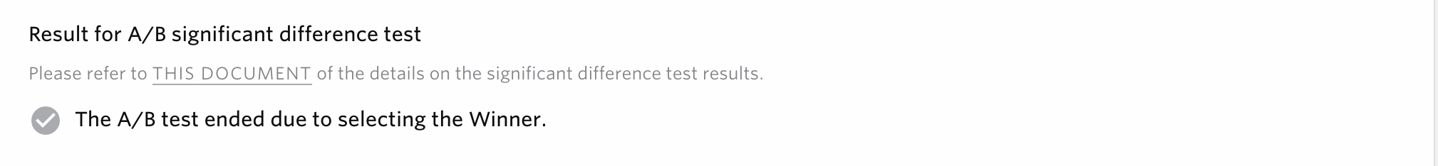
Note
Below is an example of when the winner pattern is selected from the A/B test significant difference results. The comparison results of the rest of each pattern will not be displayed.
Campaign Progress
The charts will show the Button1 CTR, Button2 CTR, Main CVR and Sub CVR of each of the patterns.
Status List Screen
You will be able to check the status of the A/B test for each campaign here, when the operating campaign is either live or not. Icon display conditions are as follows.
Icon |
Display conditions |
|---|---|
|
A significant difference exists, and the results of the pattern exceed the baseline at least once |
|
A significant difference exists, and the results of the pattern are only of ones that fall below the baseline |
|
Only patterns without significant difference |
|
If all patterns can’t be calculated |
|
If winning pattern is already selected |
|
When either the targeted indicator or the baseline pattern of the A/B test is not set |
ー |
When the campaign is not conducting A/B test |


Note
In the instance of a campaign that has a significant difference with the baseline having both exceeding and falling below results, it will be displayed as the results of the pattern with at least one exceeding the baseline.
For questions, please visit the FAQ.
Select the winner
Once you select the winner, all after deliveries of the same in-app message will be using the selected pattern to all target users.